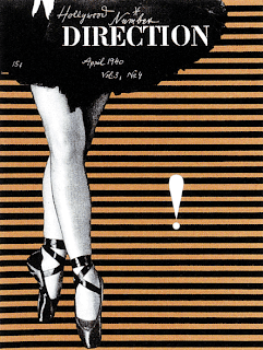
 I found this piece of graphic design work on Flickr.com, while researching some more work to blog! This is a 1940's Direction Magazine cover design, created by Paul Rand who was an American master of advertising art. He was one of the first in the U.S to be using the term "Graphic Design" at that time period, best known for designing corporate logos. He also designed the well known poster in 1981 for the company "IBM" (Eye Bee M), this design is well known all around the world for its simplicity.
I find this poster to be so very interesting becuase it is so simple but yet very abstract and different! The design seems quite simple, only using grayscale and a beige colour in the background, but making it very efficient and abstract for the readers, where the ballerina image stands out from the stripy background. I find the design such a classic, just the way it uses the rule of thirds (The ballerina image taking up 1/3 of the layout & the other 2/3 of white space). I also quite like the inconsistencies in the lines, it makes it so much more unique.
The font used in the header of the design ('Direction") is Stencil Std, it is easily readable and stands out quite well at the top left corner of the poster. The exclamation mark to the middle right side of the layout grabs your attention just because it doesnt seem like it shouldn't be there and it stands out from the stripy background. The quality of the design is quite good considering it was created when graphic design only just started in america, this was only the start of graphic design! They would have also used the screen printing technique in creating this poster.
Viewed: 18/2/09


really eye catching and interesting image, a like how they have used only half of the ballerina, making a different and intriguing composition. very cool.
ReplyDeleteYour write up is great. Good research. GO PAUL RAND
ReplyDeleteLove it! i just think its great seeing pieces of work done so long ago, yet still look modern today
ReplyDelete