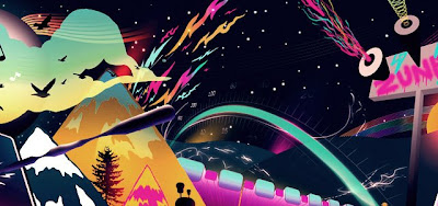
The image that i have chosen is called “Zune Journey”, i just find it so interesting and loud because it is so bright and eye-catching to the viewers because there is so much to look at and you just want to absorb all the different information and images. There are parts in the image that make your eyes move around, especially with the flurescent colours being used. Even though we know that the image is flat, the way the image has been created makes it seem more 3D looking because the way the different vectors use a variety of gradients, also creating movement and flow through the graphic image. I love how nothing in the image actually makes real sense, but i think that makes it much more unique.
There is only one bit of typography used in the graphic image, where it says "Zune", no idea what that means but i guess that helps with the interesting side of the design. It is written in a creative way, making it look like graffiti, which works well with the rest of the design. Your eyes start at the left side of the design, where the design looks like it stands out from the screen (3D effect), slowly moving across to the right side where yo come across many different features. I find the quality of the design extremely good, because it uses so many different skills using Adobe Illustrator and it doesn't have any boring parts to the design.


Ha ha i just love the word Zune, its justs fantastic! haha
ReplyDeleteIts so hard to make gradients look successful and i believe Chuck Anderson did a successful job in doing it, so good on him!
It defnitly has good use of movement and balance on the page! The colours are fabulouse, all bright and colourfull, absorbing! The subject matter is also interesting and almost telling a story. I like it!!!
ReplyDeleteThe colours are really neat!
ReplyDelete