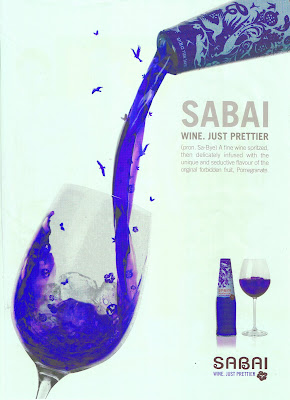
This advertisement is supposed to be in red, rather than this purple colour! I was reading through a cosmopolitan magazine while looking for adverts and interesting things to write about for my blogs, when i found this cool Ad on Sabai wine. This is an ad selling wine, from the brand 'Sabai'. It is advertising a newer and "Prettier" wine, that is made of Pomegranate fruit. I really liked this ad when i first saw it because of all the little things on the page, the birds flying in and around the wine glass, flowers and butterflies and other "Pretty" things. They are trying to portray that when you poor yourself a glass of Sabai Wine and drink it, that it is literally pretty and is the most unique wine you can drink!
I didn't realize at first that this ad has Art Nouveau style inspiration in it, but after learning about the movement i could see it straight away. The way the design on the bottle has a nature feel to it (organic plant-like feel) with all the different animals and swirly shapes created on it. This is typically influenced from Art Nouveau, which also uses a lot of simplistic shapes and silhouettes. Vincent Van Gogh was an influence to this movement, which can be seen in the swirly shapes in the package design. The design is very delicate and elegant which they would have wanted to portray as the wine being, and i think they have done well conveying that idea, although i don't drink wine its kind of convincing me to try this!
The ad uses a very modern typeface, being quite bold and very easy to read! I also just realized that the bottle in the top right corner has written on the top "Serve well chilled", which is probably another reason why they have got ice in the wine glass to convince people to try it that way. It is a very simple design, it doesn't very much space of the page, leaving a lot of "white space" around the page, while only using a "header", "Kicker", a little bit of "Body Text" to inform the readers about the product, and then the products logo and a motto for this particular product, which says "Wine.Just Prettier" in all caps.
All in all i quite like this advert, just the way it uses influences from past art movements though still having its own style to it!
Reference: Cosmopolitan Magazine, February 2009
Viewed 12/3/09


Haha I quite like reading your stories, they are always so big lol
ReplyDeleteGreat ad, love the red colour, shame it only came up as purple.
Its good you noticed it as Art Nouveu