Tuesday, June 30, 2009

"Smiggle"


I think i fell in love when i came across this shop, while in a shopping centre in perth the other weekend. It sounds pretty crazy, even from me but its true, its probably the most exciting stationary shop i have ever come across! The products that they sell are fun, fashionable and greatly targeted at younger people and kids. I stood in that shop for maybe 20 minutes trying to decide what ti buy, it was pretty hard must i say! There are so many cool things to choose from: pencils, pencil cases, eletric sharpeners, note books and many more! I really needed a new pencil case, and i ended up finding this really cool silver metalic-looking one. Not only are the things they sell fashionable, but quite handy! It's such a great business idea, i never thought stationary shopping could be this fun, who knew? I was probably the oldest in that shop, all the other customers were primary school kids :) I didnt really care at that stage, as i was soo astound at the amazing things that they had for sale, i had no care in the world, no one knew me! 

Even just the logo is fun, simple and very child-like and playful, which i find very interesting! The Smiggle business is all about great Design, great Value, Colour and Graphics, being clever, coordinated, eco aware and having, why would't you want to live the true "Smiggle" experience? It's a very modern way of seeing stationary and how it can be portrayed to the public. 

"Sumo Salad"


I recently went to perth for the weekend and i went to one of the shopping centre's and came across a great little franchise fast food outlet called "Sumo Salad". It's not a new business, as it came across in 2003, but i'd never tried it so it was new to me :) 
They sell fast and healthy food to the public, that is fresh and convenient to eat. It was so good to actually see a healthy food outlet other than the usual unhealthy fatty food places, "Red Rooster" or "Macdonalds" that everyone is obsessed with. I dont eat much fast food, so it was good that they have created something a bit more suited to "healthy eating" people as such. 

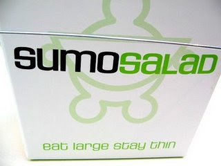
Not only did i LOVE the food there, but their packaging and advertising designs are great! The logo is so simple, but yet very effective because it portrays their name and purpose of the business. Using just white and green is such a simple and effective idea, because it doesnt stand out as such, but is ideal for portaying the "healthy" side of the business. 

I love the typography used througout all the packaging and advertising, it is so modern yet so very eye-catching and very playful and attracting to the "younger" public to eat healthier. I love the way their slogan is "Green by Colour" "Green by Nature", it is such an ironic thing to advertise, because so many food outlets want to seem the healthiest to grab the audiences attention, but i find this business is going to thrive, just shown by the food they make and the promoting they do! 

The designs are so minimalist, but in this fact "less" is definatly "more" in this case. The less that is going on in the designs, then the more people pay attention to it and the more successful the business will become.  
Not only do we as customers enjoy our healthy salad, roll or soup, but we feel and look great with their colourful packaging. Now how often does that happen when buying fast food? Definalty not that often, not for me personally. I will definatly buy their food again in the close future! 

Monday, June 29, 2009

"Colette"


I found this packaging design on Flickr.com, my favourite searching website :) What brought my attention to this design was the fact that is has an "Art Nouveau" influence . It seems to be a concept design for "Body Oil". The organic and natural feeling to it is very much the art movement, as well as the bright and contrasting colours being used on the design. As far as it looks this is only a concept idea, and hasn't been created yet as a product.
It is a very feminine design i find, especially shown by the colours and the "girlie" feeling to it. The typography used on the bottle is also very Art Nouveau, with a very elegant and natural flowing feeling to it.

The white background also makes the package seem quite clean and simple, but yet very effective, with the fact that the bright contrasting colours come forward off the page.
Even though there are gradients being used on the design, and they usually look really tacky and badly presented, i find they have done quite well with pulling it off. It just makes the design more delicate and feminine in a way that is soothing and comfortable to look at.

I would really like to see the final product, to see if it would be popular or not. I find a lot of people buy products according to the "natural" side of the product, although people still judge the cover of products, even if its not relevant to what they intended to buy, but that's the aim of packaging and advertising these days! I really like this design, as they used the help of art Nouveau to influence there creativity.

Wednesday, June 24, 2009

Gloji " The Juice that makes you glow"


I just love this package design, its such a clever design idea the way they use the shape of a globe to package juice. Their slogan for the brand is "The juice that makes you glow", it is so simple but yet very effective and ironic, in portraying the bottle of the juice as a globe. Whoever thought of this idea has defiantly thought outside the square and has done very well in doing so, it is a very brave concept that hopes to become more popular over the years.

I retrieved this design off flickr.com after researching, and the uniqueness of it just stood out to me. I also looked up the website, and it shows various other products with the same "globe" idea.

The typography on the bottle i find is quite relevant to the brand itself. It has a very organic and natural feel to it, which seems to be the target of the product. Using white font is a simple but great idea as there is only minimal text, and it doesn't draw too much attention away from the bottle or the actual product inside the bottle.

There isn't much else to say about this product, but other than i wish i had designed it and said it was my own :) I really enjoy the simplicity of it and the genuine "energy" feeling of it. Great design!!!


Retrieved: 25th June 2009
http://www.flickr.com/photos/11861905@N02/3340819850/

Sunday, June 14, 2009

Gubble Bum


I was researching packaging designs of Flickr.com when i came across these really cute Bubble Gum packaging called "Gubble Bum". They have been created by a freelancing Graphic Designer called Jesse Kirsch, who has also designed a few other different packages for other products.
The packages come in all sorts of various colours, with different facial expressions in a match box size. I just really love how the designs are so simple and easy to identify, there is such humour in them and it makes you smile just looking at them without thinking of the purpose of them.

The typeface used on the packaging i find is very suitable to the product, having a 'Bubble" feeling to it. It is a sans-serif type, with the use of very subtle curves and thickness to it.
It's such a playful packaging design, for such a simple product. It is a very clever design, most likely targeting kids and teenagers.
The colours of the boxes are very bright and attracting, which is defiantly useful when trying to get attention from kids, they love anything colourful and bright.
There doesn't seem to be any influence from previous art movements, but there is defiantly plenty of creativity involved in the designs. Other graphic designers may have influenced this particular designer to get inspiration from, in developing these packaging designs.

Overall, i find these designs awesome and very creative and they will become very popular in the near future when someone discovers them. I would defiantly buy one if i saw them at the shops!

Reference: http://www.thedieline.com/blog/2008/02/jesse-kirsch.html


Wednesday, May 20, 2009

"Asko"

Here is an advertisement promoting "Asko" products that are environmentally friendly and have a long life span. I think this advert is very intelligently made, the way it has ”Surrealism” influence to it, transforming the washing machine into a bucket. I just find it so interesting and clever the way the designer has done this, because it is different from other ad's and it isn't a "normal" way of advertising a product. 

As I mentioned before, the advert has a surrealism style to it, the way it doesn't portray "real-life". There isn't really any specific typeface being used in the advert, as the only type in the ad is in the bottom half of the ad, the "text type". The type being used is very simple and easy to read, shown in regular and bold.

The advert shows a lot of "white space" around the product, making it look extremely clean and tidy, which is probably what the company wants the consumers to think about their products, as well as being efficient and environmentally friendly.

You can easily tell that the washing machine was edited in Adobe Photoshop; because of the way it has been done nicely and neatly, without being able to tell that it isn't "real".

 I find this advertisement to be very simple but yet very effective in trying to sell their products, I would defiantly consider buying a washing machine from them because they have done well with this ad. The layout of the ad is very clean and professional, also placing the logo in the bottom right corner of the ad, which we directly look at last before turning the page of a magazine.

Overall I really love this advert from the moment I saw it in the magazine. The suppleness of it is so soothing and easily to look at which every reader likes to have.

Reference: Houses Magazine, Issue 56

Wednesday, May 6, 2009

Body Shop Billboard

Here is a billboard created for "The Body Shop" company, advertising that they make and sell products that are environmentally friendly and made with Passion.  I really like how they have incorporated their logo into the design of the tree in the far left top corner. It gives the design an individual feeling to it, also conveying the fact that they use natural ingredients in their products. I really like the products that the body shop sell, so i thought i might research some advertisements that they have made, that is when i cam across this example on flickr. 

The type of style this ad portrays would probably be similar to Art Nouveau, the way they use organic shapes and how the design is very delicate with the flow of the strokes in the grass. The body shop logo also seems to have influence of art nouveau, because of the curving and the roundness in the design. The typeface they defiantly have used in the billboard would have to be "Helvetica", using bold font in the "kicker" and regular font in the "less important" wording. Helvetica is used so nicely in this design, because it is neat and simple and great in portraying the purpose of the ad. Helvetica is also the type used for "The Body Shop" logo and branding, so it is obvious to be using it. 
You can easily tell that this design has been created in Illustrator, shown by the "paintbrush" strokes to create the tree trunk. The flowing of the organic-looking strokes also help make it feel so much more natural and friendly to the readers. 

Although the design seems to be very free and creative, in the way they have incorporated the logo throughout the design, using very bright and eye-catching colours to grab attention, i find it to be a very simple and effective way of selling their products. They don't have to do much to sell their brand, because everyone knows their logo and what their aim of their company is, which is selling environmentally products to look after the planet and keep it safe from chemicals and other bad things that ruin the earth. 

Overall i just love this design, from the moment i found it i couldn't help but love the simplicity of it and how intriguing it is to look at. I especially like how they have incorporated their logo throughout the design, as it makes it so much more personal to the company. The bright colours used also brought my attention straight to it, and it defiantly makes me want to buy some natural products from them!

Reference: Retrieved 7th May, 2009,  http://www.flickr.com/photos/21456507@N04/3220358710/